Week 10
Focusing on Features
Downselecting
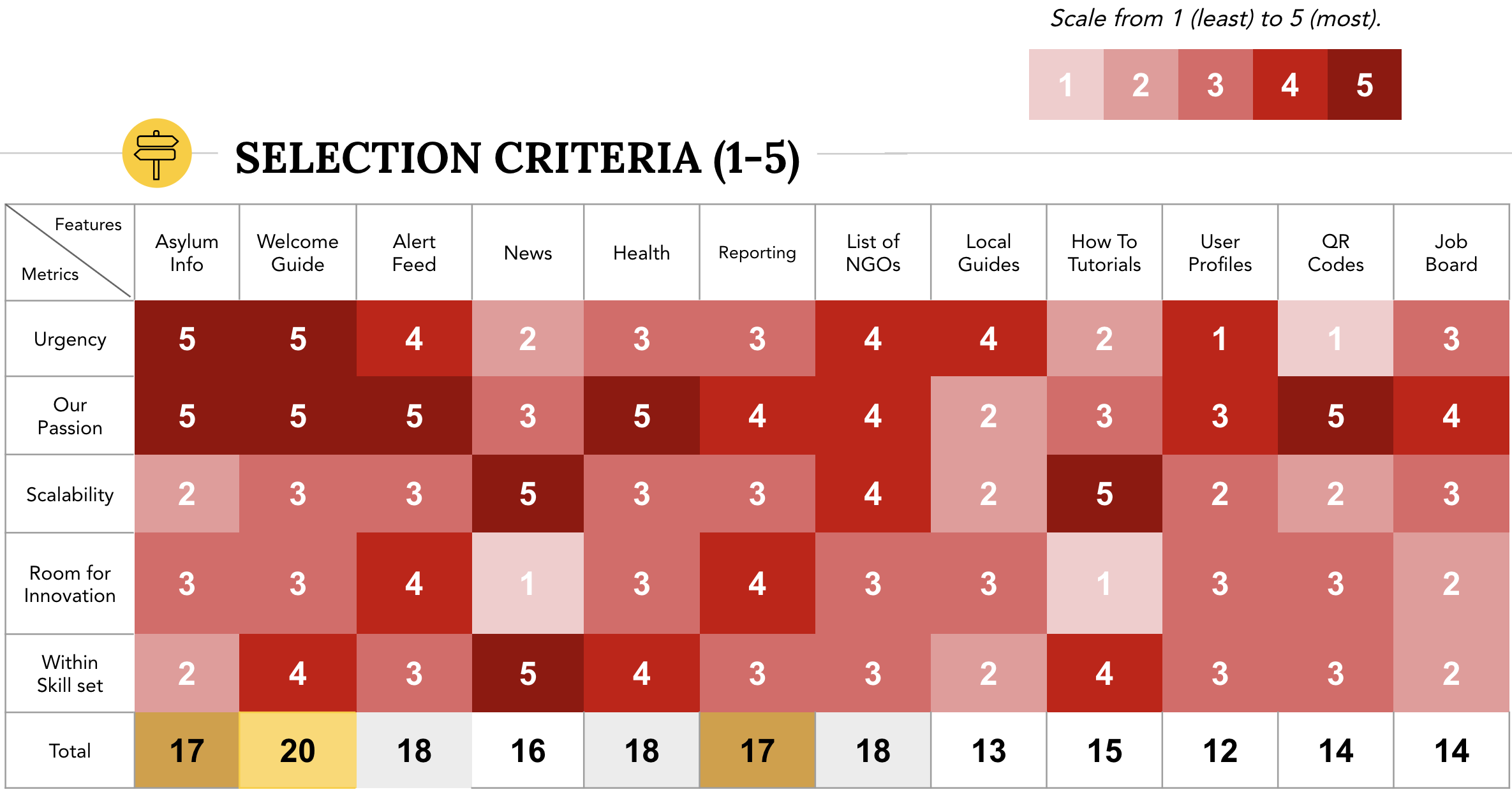
This week we narrowed our scope and efforts on two core features: LiveMap and Welcome Guide. Our decision was based on a detailed selection criteria such as urgency, scalability, and personal enthusiasm.
LiveMap
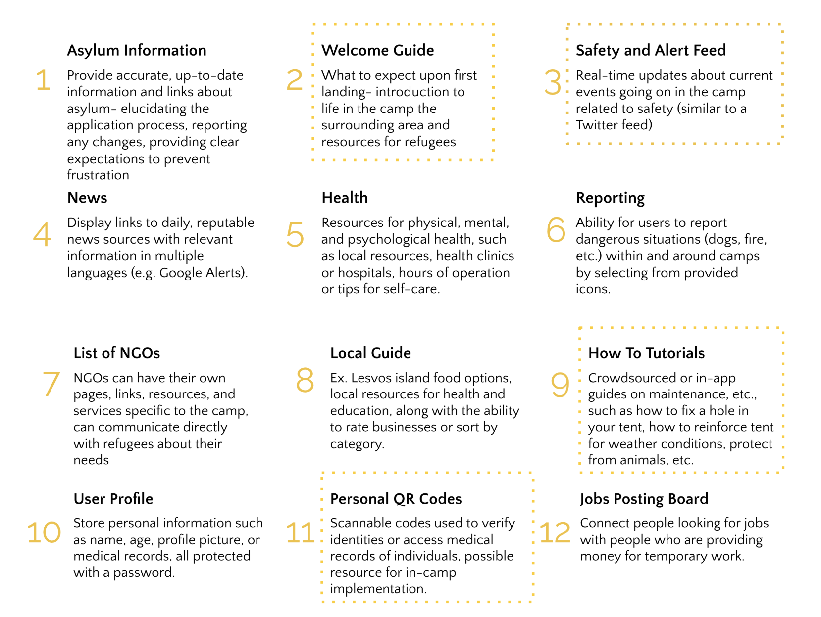
Despite not making it onto our original feature list, we were always passionate about building a form of crowd-sourced, real-time information outlet. LiveMap encompassed overlapping features like “Alert Feed” and “Reporting”, while maintaining its idiosyncrasy from existing refugees products on the market today.
In terms of design, we wanted to model after the UI of Waze, a community-driven navigation app that uses crowdsourcing to map out POIs on the road. Specifically, we saw three main benefits to how Waze structured its reporting screen:
- Straightforward images removes need for translation
- Large buttons mean fast response-clicking times
- Dropping report directly on current GPS location minimizes user confusion
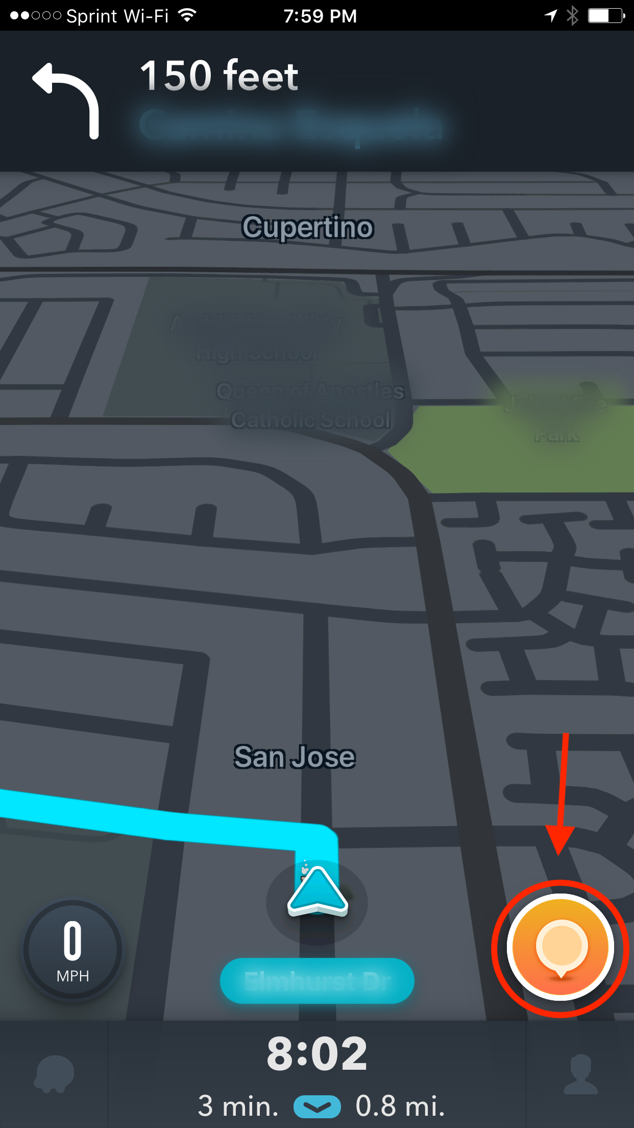
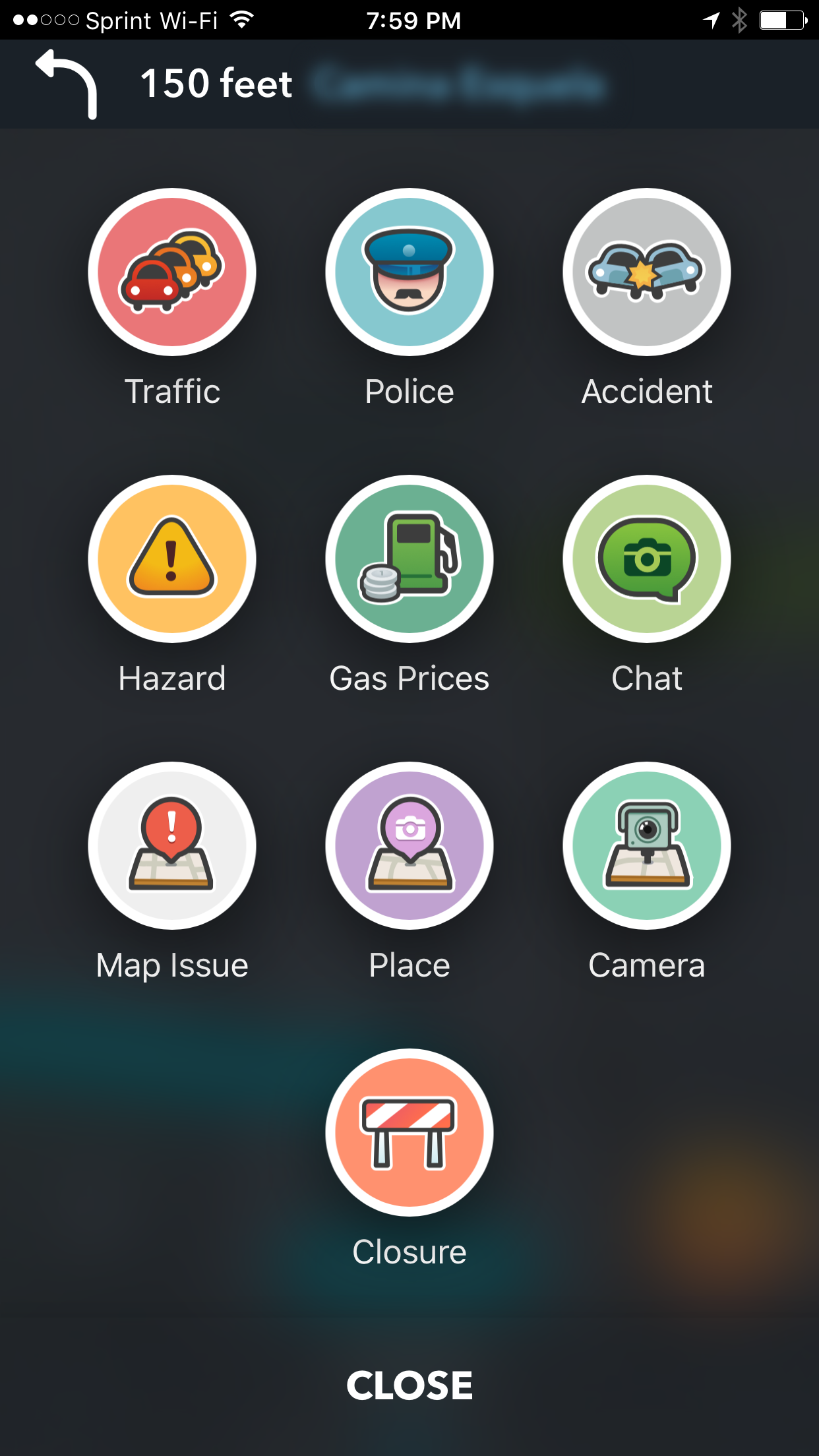
Like Waze, we would integrate the report button into one corner of the screen for both easy access and minimal cluttering of the map.
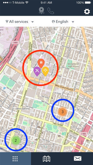
Speaking of maps, our idea is to pinpoint Points of Interest (POIs) by grouping similar reports within a certain radius of each other. Here, I will build off the UI of RefAid (one of our competitors) as a reference point for my design. Stable POIs (indicated by a red circle) like buildings, food lines, and showers are specified using icons and a pin on the map, while more ambiguous but trending POIs (blue circles) will be labelled using the number of reports and a color that signifies its intensity, e.g. red for danger, grey for mild concern.
Welcome Guide
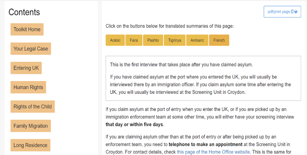
In our cursory research, we were shocked to discover that not a single refugee resource targeted life within camps/displaced locations. In contrast, there was a plethora of resources about integration into individual countries, the asylum process, and legal information. We felt that this was an untapped space that we could easily fill. That being said, we knew that we had to do it right. There were a few things we wanted to emphasize:
-
Minimizing clutter. Omar, our team member who’s been through the refugee process, was continually frustrated with the disorienting UI of most refugee resources. It took forever just to navigate to the correct resource. This is related to point two:
-
Avoiding information overload. Even when he eventually found the information, it was not in an easily digestible form. It was a wall of text (often unrelated) with no helpful images or diagrams in sight. Trying to find details that directly relate to your situation was like finding a needle in a haystack. And finally,
-
Modularizing continuity. To us, this meant separating information based on where users were in their journey. For instance, people who just arrived at the camp would primarily want to know the location of POIs and where to obtain basic necessities like clothes and tents. People who have settled in for a bit would care more about daily activities and things to do in the neighboring town/city. Rather than dump all of this information in one centralized location, we break it up into digestible pieces with a clear sense of progression, much like stepping stones in our users’ journey.